How I work
Design systems
A design system is the set of product decisions a team should not have to make repeatedly. I move those decisions into tokens, component APIs, types, validation, and governance so they survive individual files, people, and tools.
They get a link to join the workspaceEnter a valid email address
Tokens
Tokens before components
I start with the decisions components should inherit:
- color
- typography
- spacing
- radius
- elevation
- theme
- brand
At S&P Global, I separated raw values, primitives, brand roles, and semantic usage tokens.
Brand and theme were treated as separate axes. Brand differences belong in the brand layer. Light and dark modes belong in semantic tokens. Components consume the semantic layer and do not need to know which brand or theme is active.
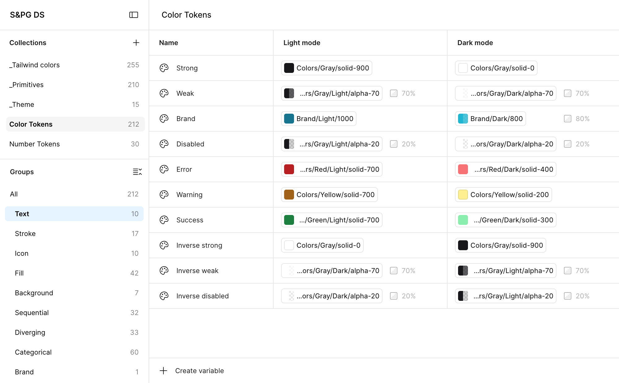
Semantic tokens, light and dark
This keeps variation out of individual components and lets changes propagate through the system.
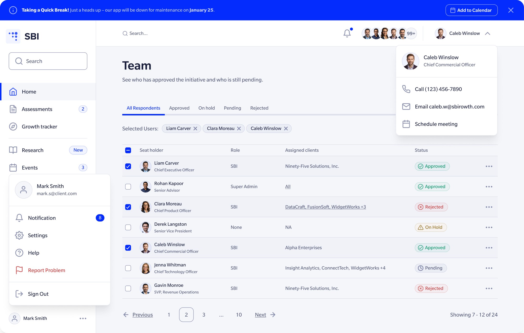 Light
Light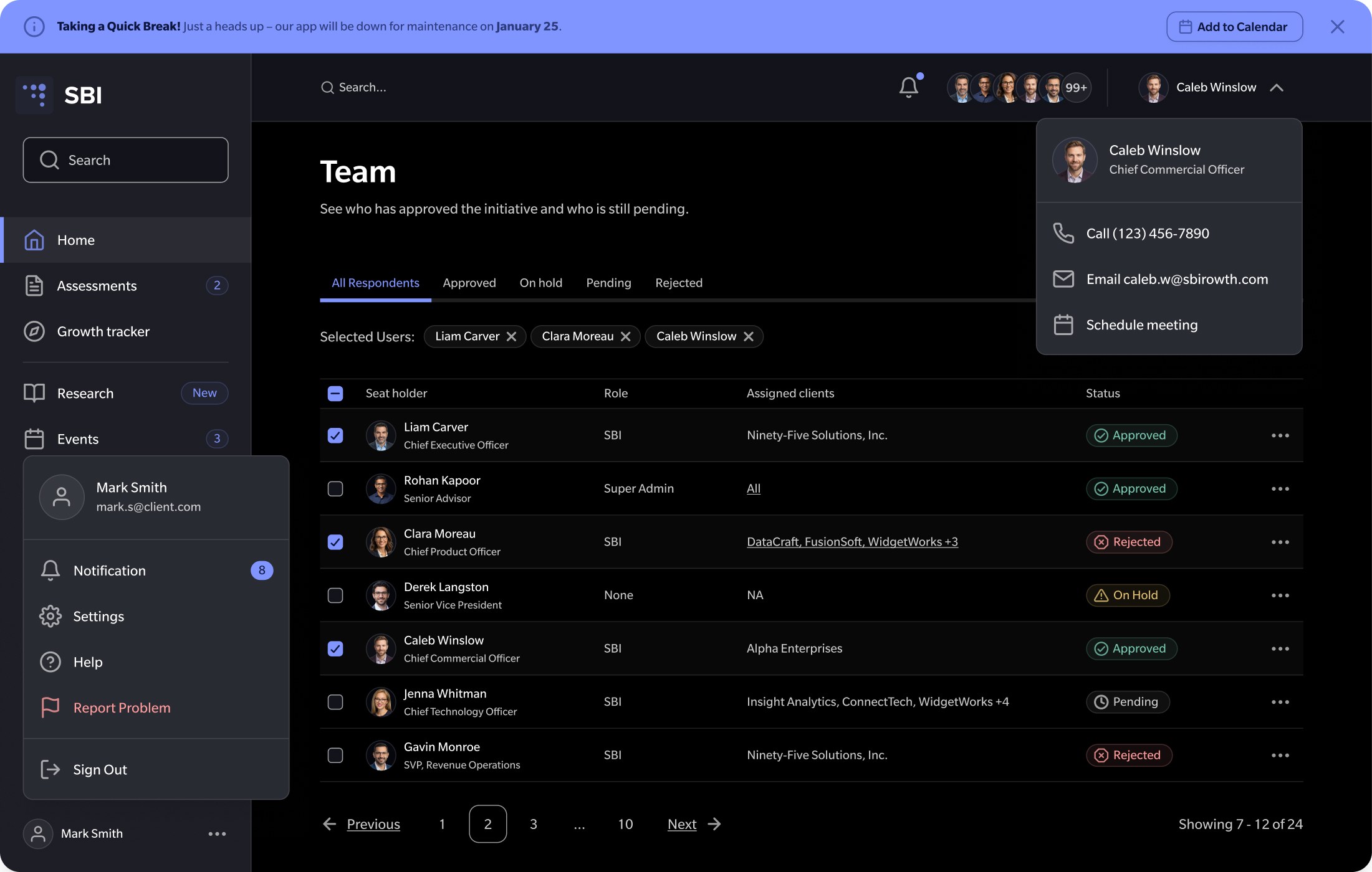 Dark
DarkDrag to compare
Promotion
When a pattern becomes a shared component
Not every pattern belongs in the shared system. I promote a pattern into a shared component when:
- it repeats
- inconsistency is expensive
- multiple teams need the same decision
- the pattern carries rules people frequently miss
Everything else can stay local until it proves otherwise.
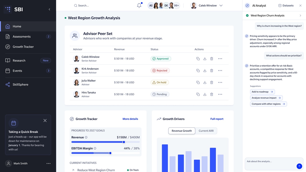
At SBI, two products shared a common foundation but retained different navigation structures and information density. Forcing them into one universal pattern would have made the system less useful.
A design system should remove decisions, not create exceptions.
Vocabulary
Design and engineering should speak the same language
Translation creates drift. Where possible, I align these across design and code:
- component names
- variants
- states
- properties
- tokens
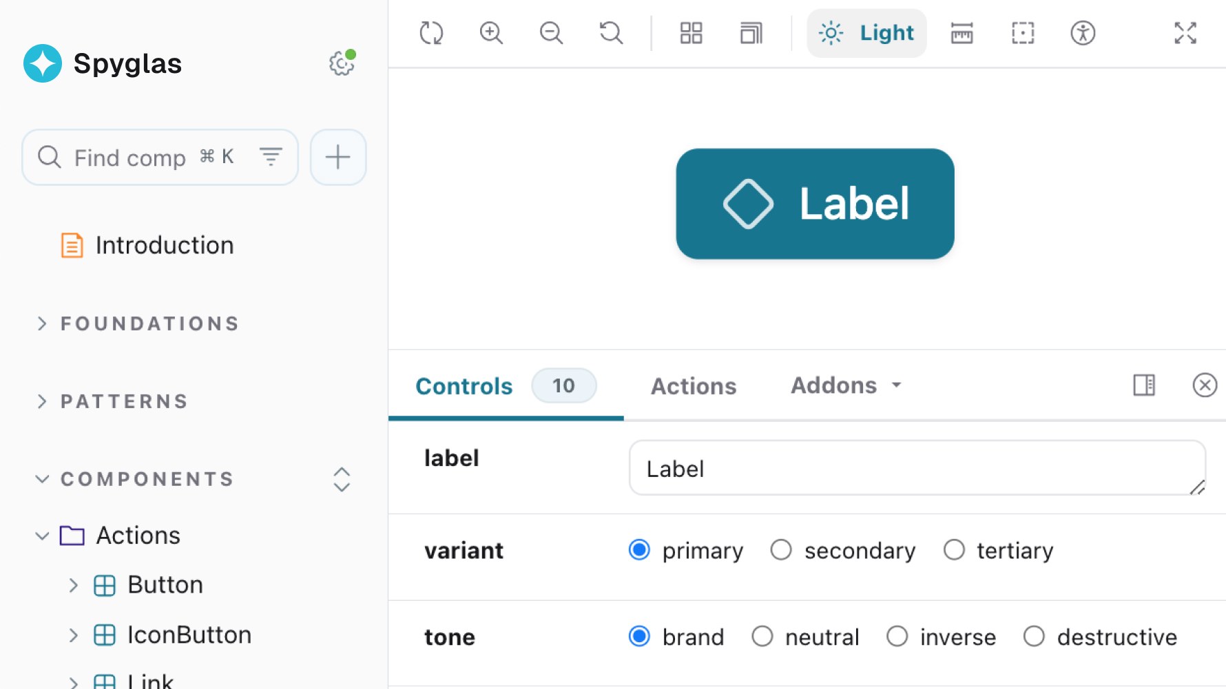
At S&P Global, Figma component properties matched the React APIs, while Code Connect exposed real implementation examples inside Figma.
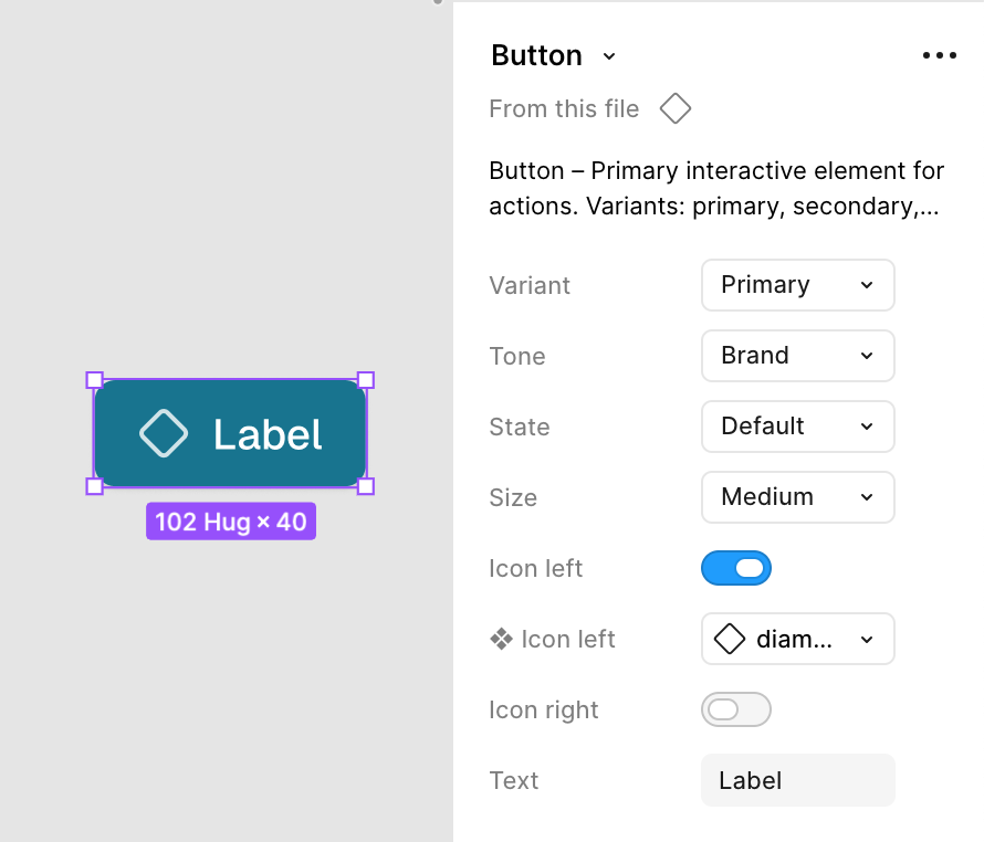
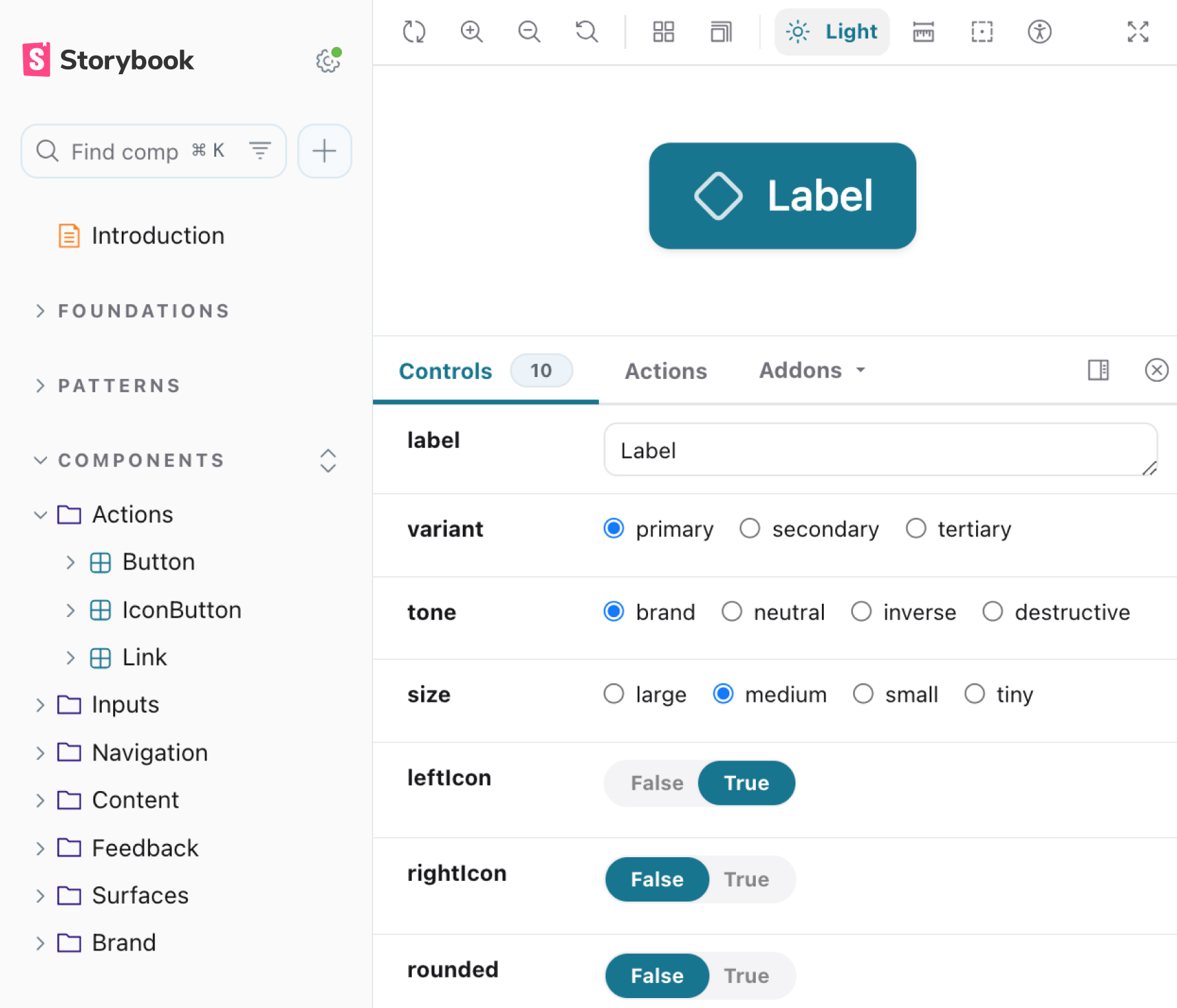
The same Button in both tools
That made a component mean the same thing whether someone encountered it in design, code, or an AI-assisted workflow.
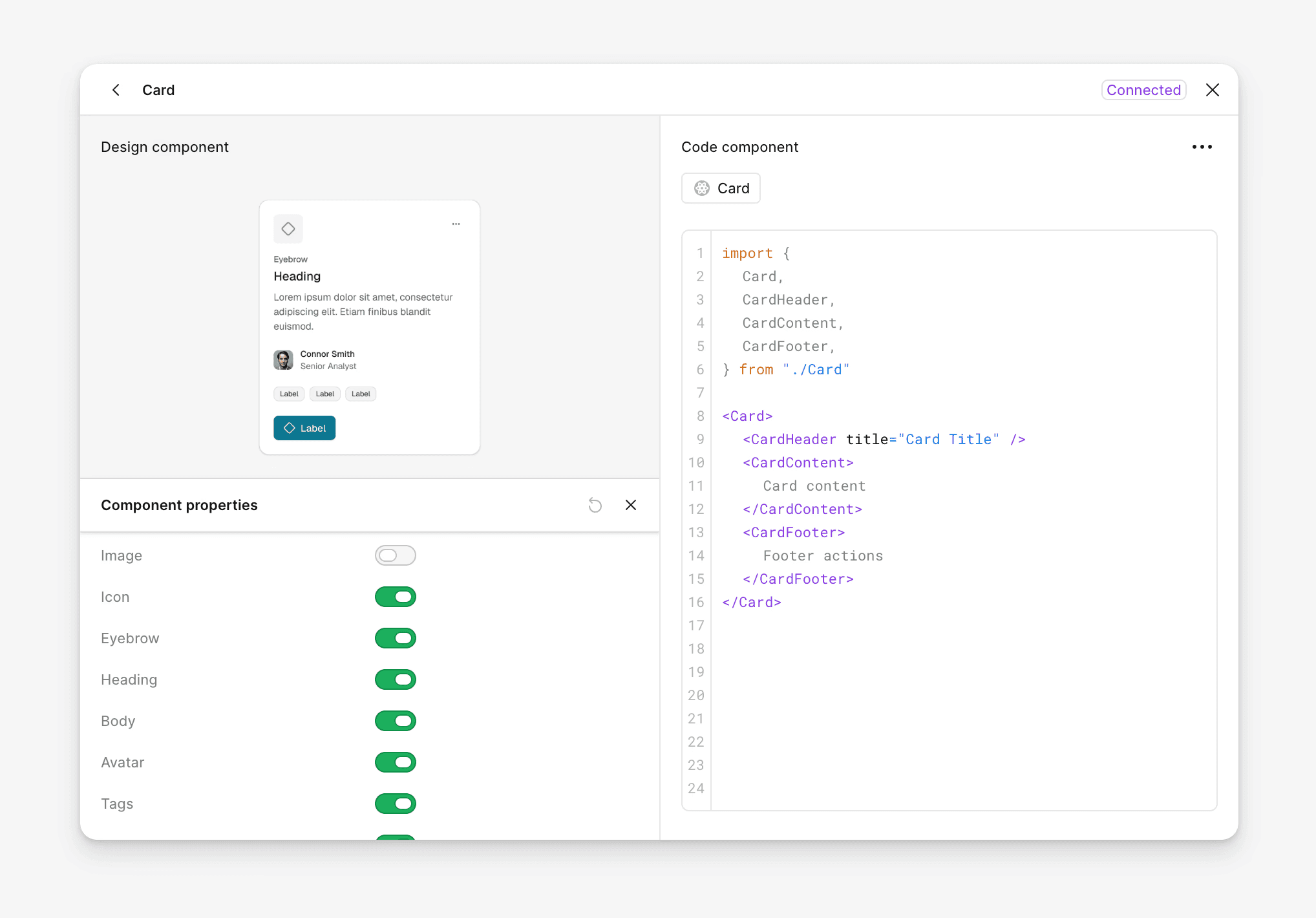
Figma showing the imported code
Accessibility
Accessibility should be inherited
I prefer accessibility rules to live in the system rather than depend on every product team remembering them. For example:
- semantic color tokens carry contrast decisions
- shared components carry focus and interaction behavior
- Storybook checks expose accessibility issues early
- common controls inherit minimum target sizes
- visualization palettes require secondary signals when color alone is insufficient
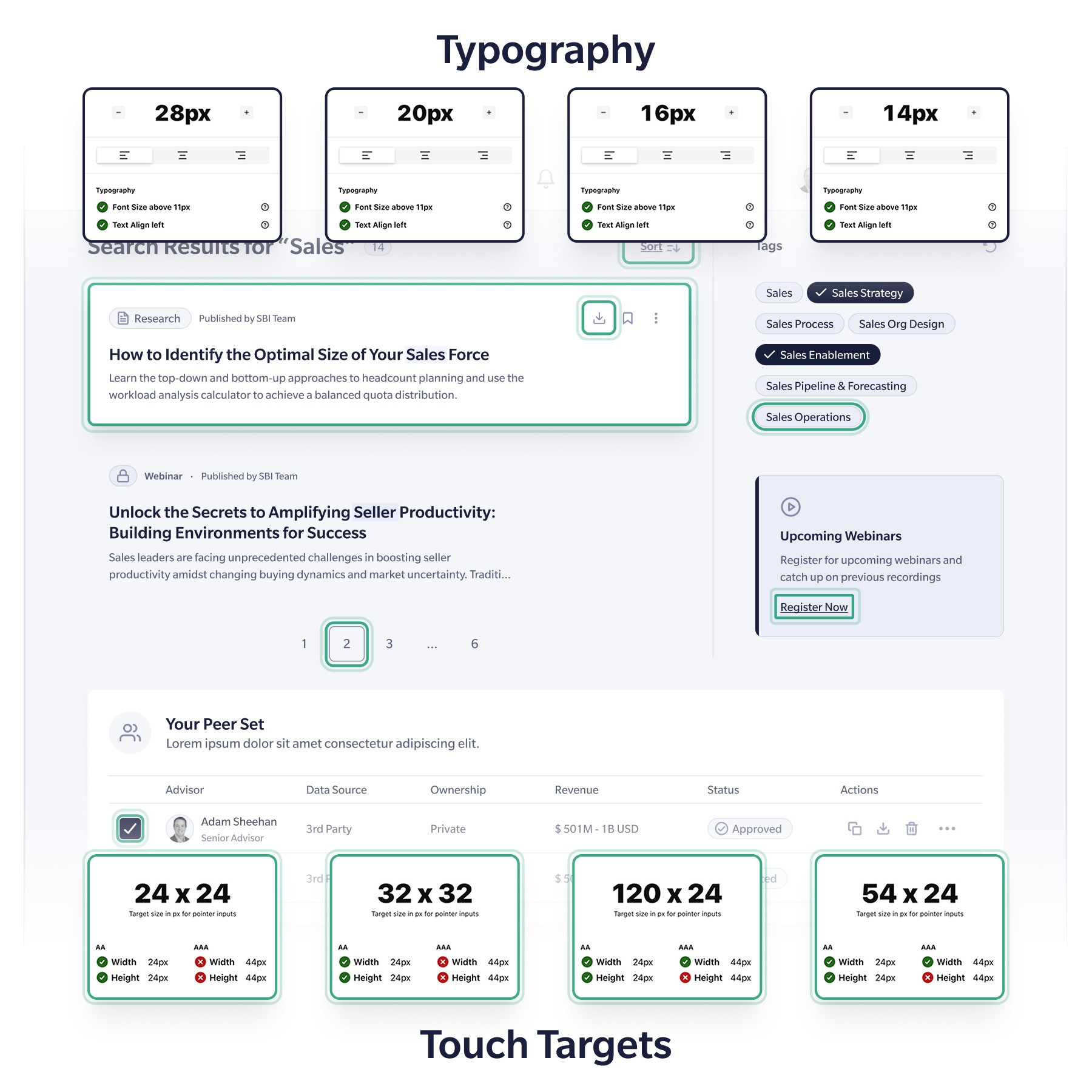
Type and touch-target checks
Fixing one shared rule is more reliable than fixing the same problem screen by screen.
Rules
Encode rules when the system can enforce them
Documentation is useful for intent and examples. It is weak at preventing mistakes. Where possible, I encode rules directly:
- Types prevent unsupported states.
- Tokens prevent arbitrary values.
- Validation catches known problems.
- Sealed components protect complex structure.
- Deprecation data defines how old patterns should be replaced.
{
  "token": "fill-brand-weak",
  "replacement": "fill-brand-subtle",
  "removeIn": "2.0.0"
}
A deprecation as data: the migration rule reaches engineers and tooling from the same source instead of living only in a changelog.
At S&P Global, I used stronger constraints only where repeated mistakes were expensive. Four higher-risk components were sealed; lower-level components remained composable.
export interface SideNavProps {
  groups?: SideNavGroupData[]
  user?: SideNavUserData
  activeItemId?: string
  collapsible?: boolean
  onSearch?: () => void
  onHome?: () => void
  onNewProject?: () => void
}
A sealed navigation takes data, not children. Its required items always render, and passing children fails to compile.
The goal is not maximum control. It is control where errors cost the most.
AI
AI makes source-of-truth problems visible faster
If component APIs, tokens, product patterns, and documentation disagree, AI can reproduce that disagreement in seconds.
My first AI-assisted workflow at S&P Global relied on written component contracts. They improved output but created another source that could drift. The later system let AI read live TypeScript definitions, component source, tokens, and product context.
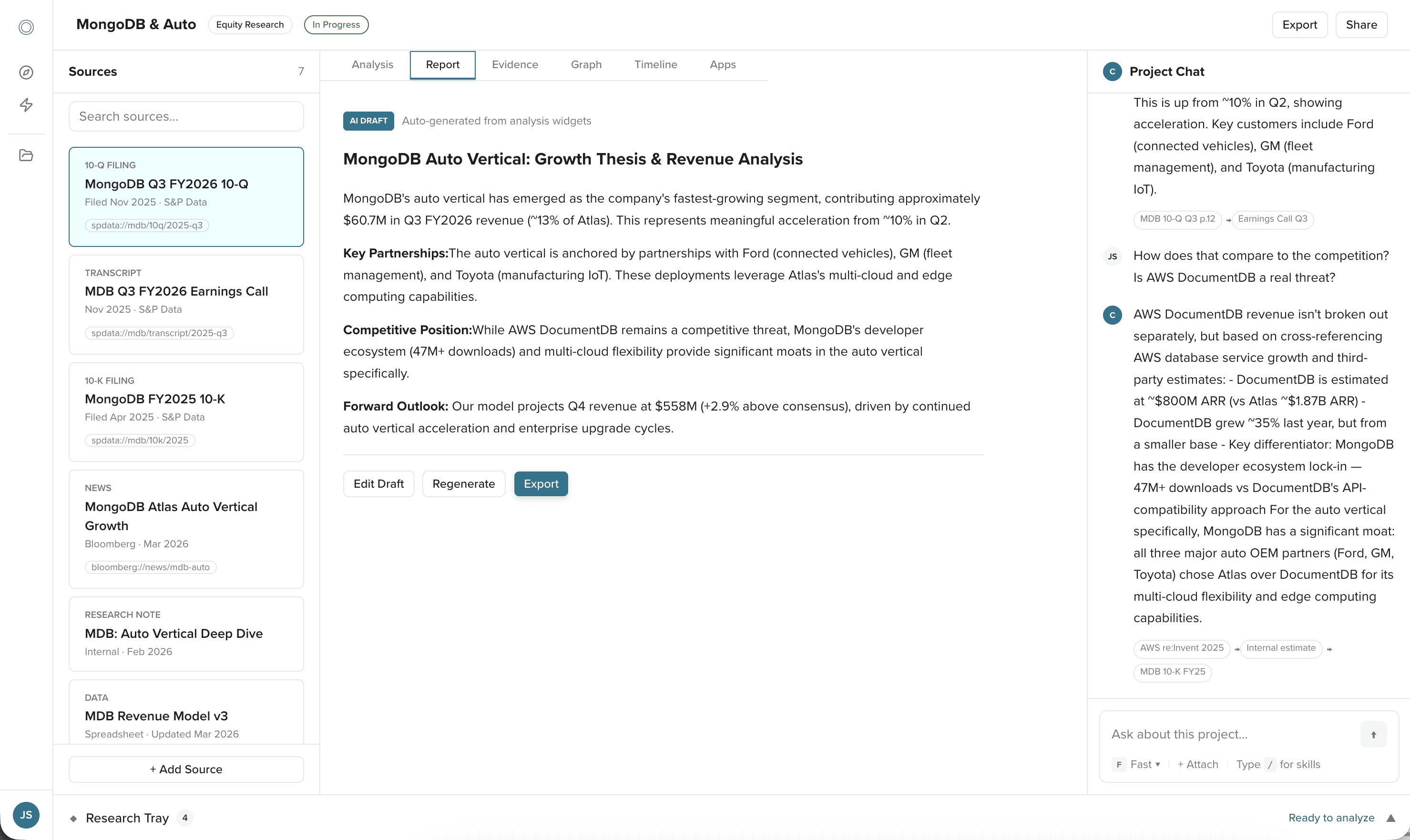
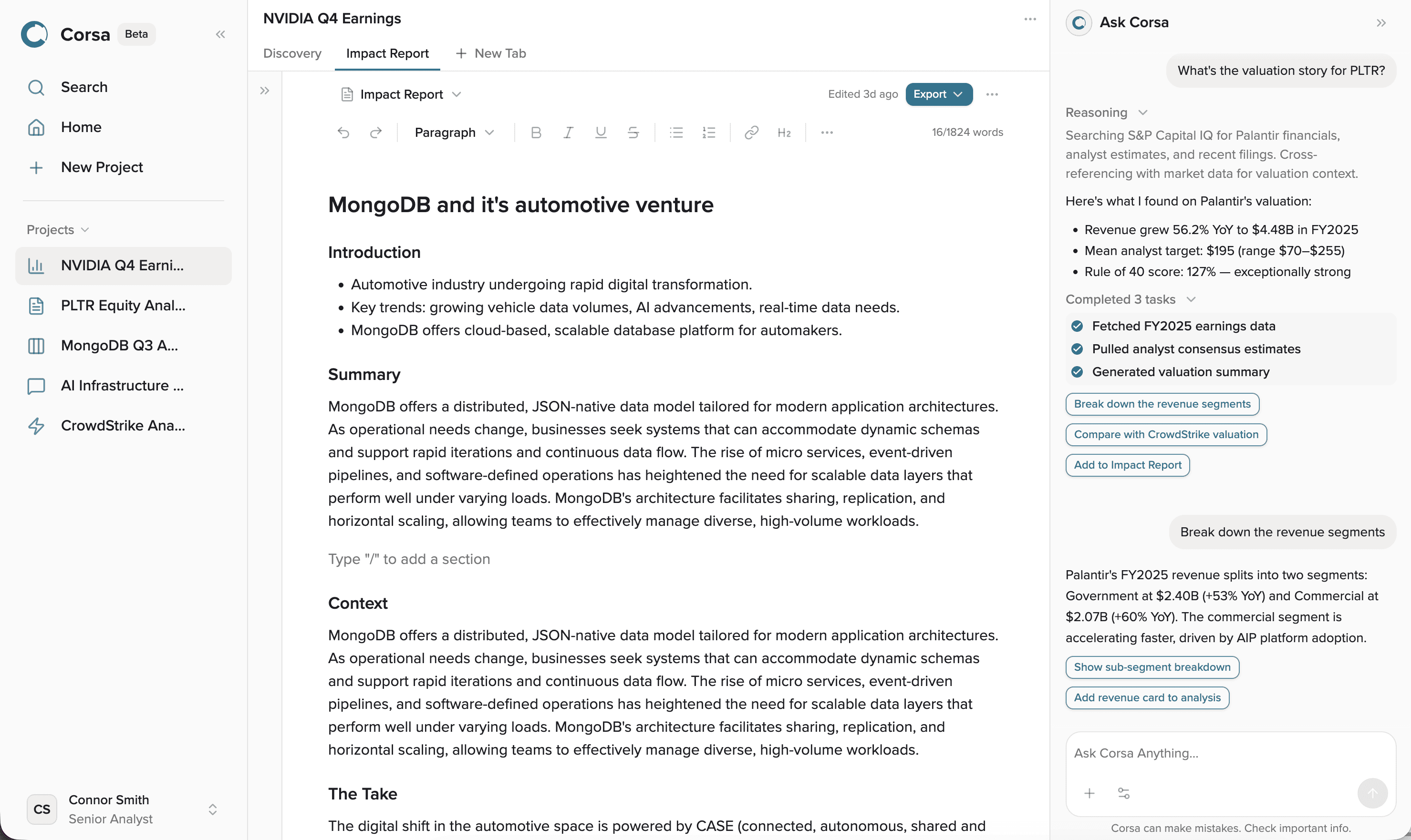
Documentation, then source
That led to a broader principle:
Machine-readable should not mean maintaining a second set of instructions for the machine.
Where possible, designers, engineers, tooling, and AI should consume the same source.
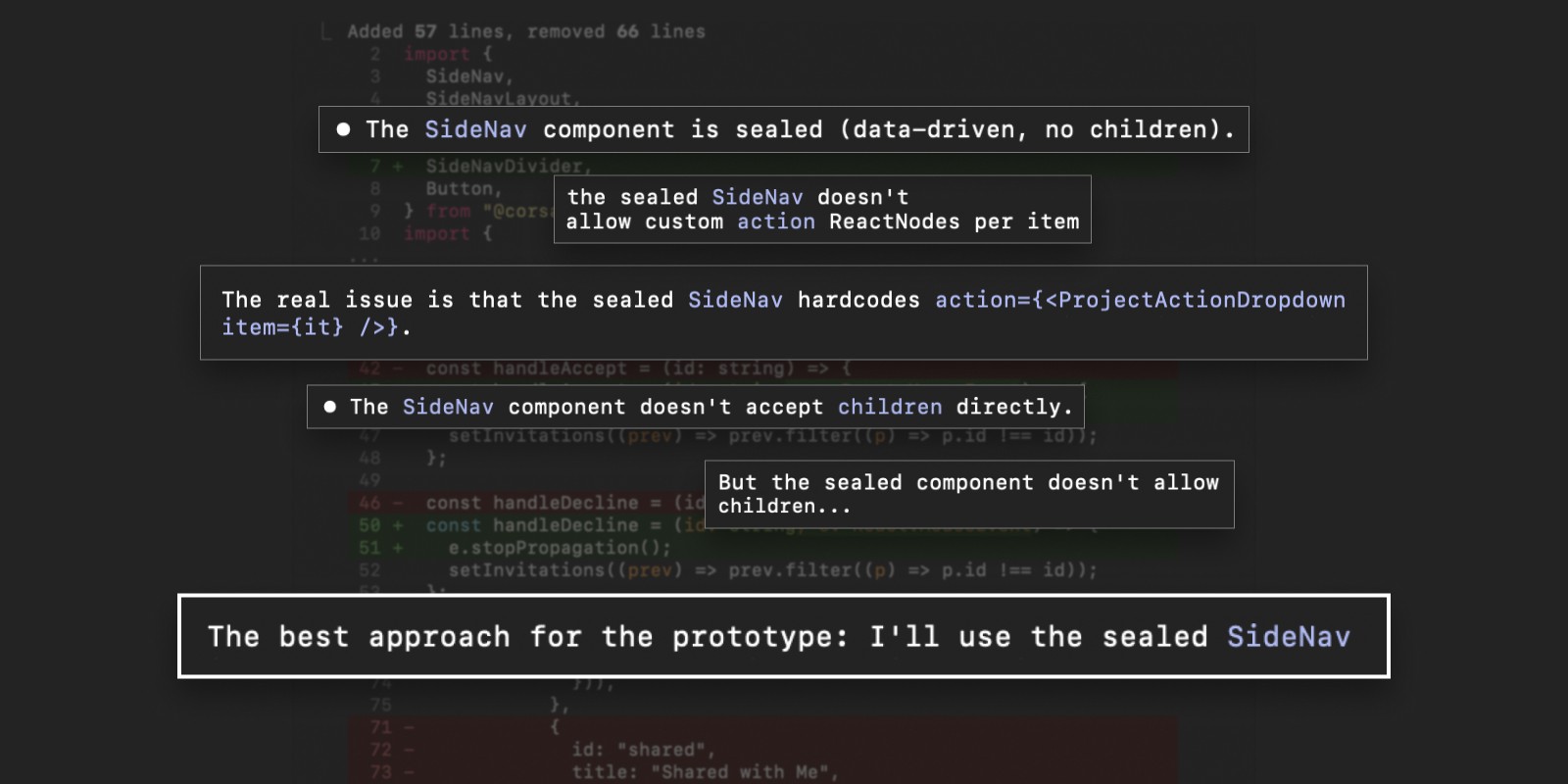
An agent inside a sealed component
Governance
Experiment freely, promote deliberately
Teams need room to explore without turning every experiment into shared infrastructure. My preferred progression is:
Need → Prototype → Validate → Review → Shared system
Once something becomes shared, its lifecycle should become explicit:
- ownership
- accessibility
- versioning
- deprecation
- migration
- release responsibility
The strongest sign of a healthy system is not that its original designer controls it. It is that other teams can improve it safely.
At S&P Global, the system reached that point when engineering adopted the library into production and began contributing to its architecture.
Impact
The value appears in the work that follows
Across different systems, the outcome was not the number of components. It was what teams could do afterward.
Coalition (opens in a new tab)
Reusable structure made it possible to integrate an acquired brand quickly.
Kontron (opens in a new tab)
A shared system reduced repeated design and implementation work.
SBI (opens in a new tab)
A common foundation reduced design-to-production cycle time.
S&P Global (opens in a new tab)
A prototyping system became production infrastructure shared with engineering.
The system matters when it makes future product work cheaper, safer, and easier to change.