Kontron · 2022–2023
Kontron: Building the System Before the Website
Kontron sells system software for connected devices. The organization had no shared component library, and I had three months to redesign the website. Instead of designing the pages one by one, I built the reusable system first. It became the foundation for the website and later expanded into an advertising framework used across 80+ campaigns.
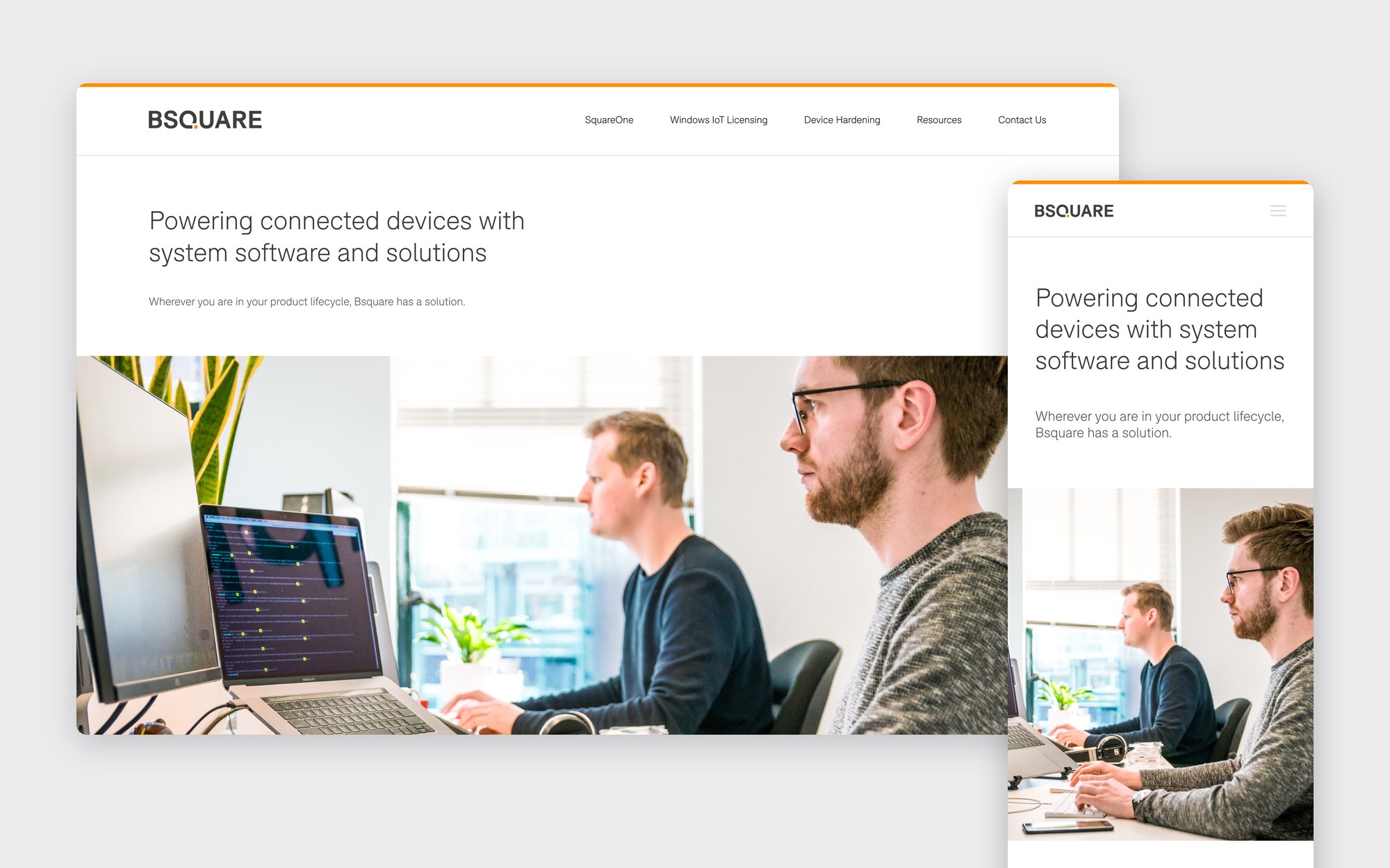
Website
Kontron had to explain several different offers to engineering buyers: SquareOne for managing device fleets, Windows IoT licensing, and hardened operating systems for Android, Windows, and Linux.
The website had no shared component library, so each page and each campaign started from its own file. A page-by-page redesign could have met the immediate need, but it would have left the next page starting from scratch again.
With a three-month deadline, I chose to invest first in the parts I knew would repeat.
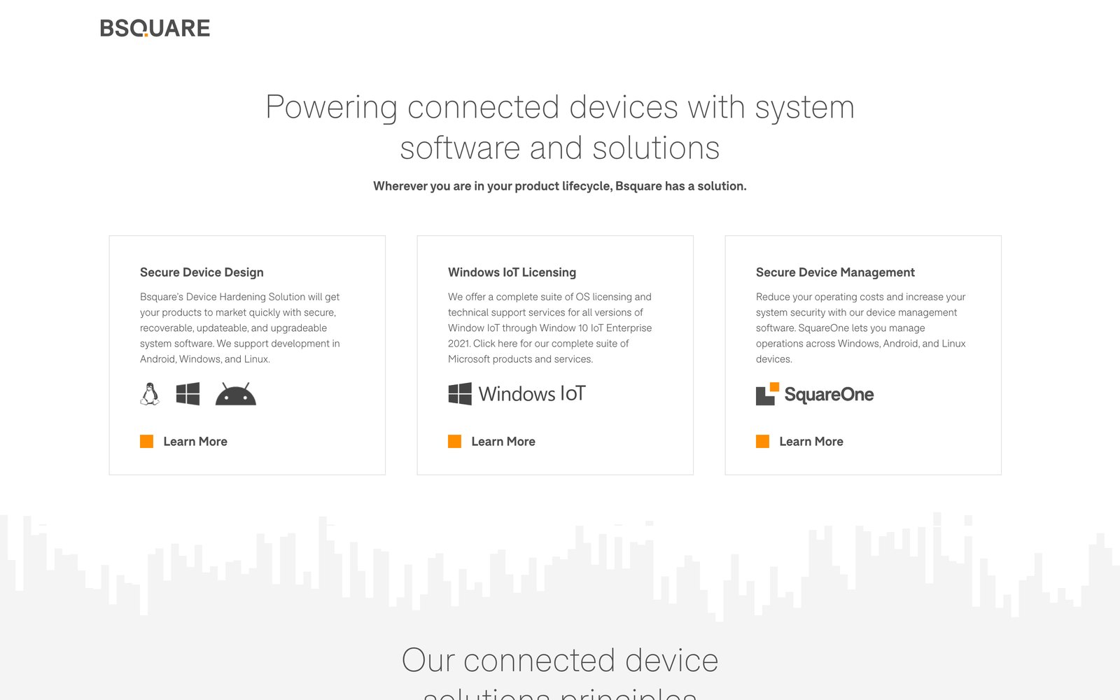
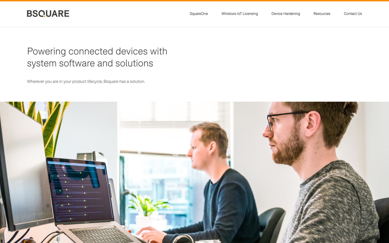
Before and after
System
I built a 40-component library covering navigation, product cards, stat blocks, industry lists, calls to action, and the footer. It became the organization’s first shared component library. I prioritized patterns that:
- appeared across multiple pages
- carried repeated layout or brand decisions
- needed to support different types of product content
- could absorb new content without requiring a new page structure
How I decide what gets promoted into shared parts is on my design systems page (opens in a new tab).
I documented it in a web style guide, from colour and type to buttons, filters, cards, and full page sections.
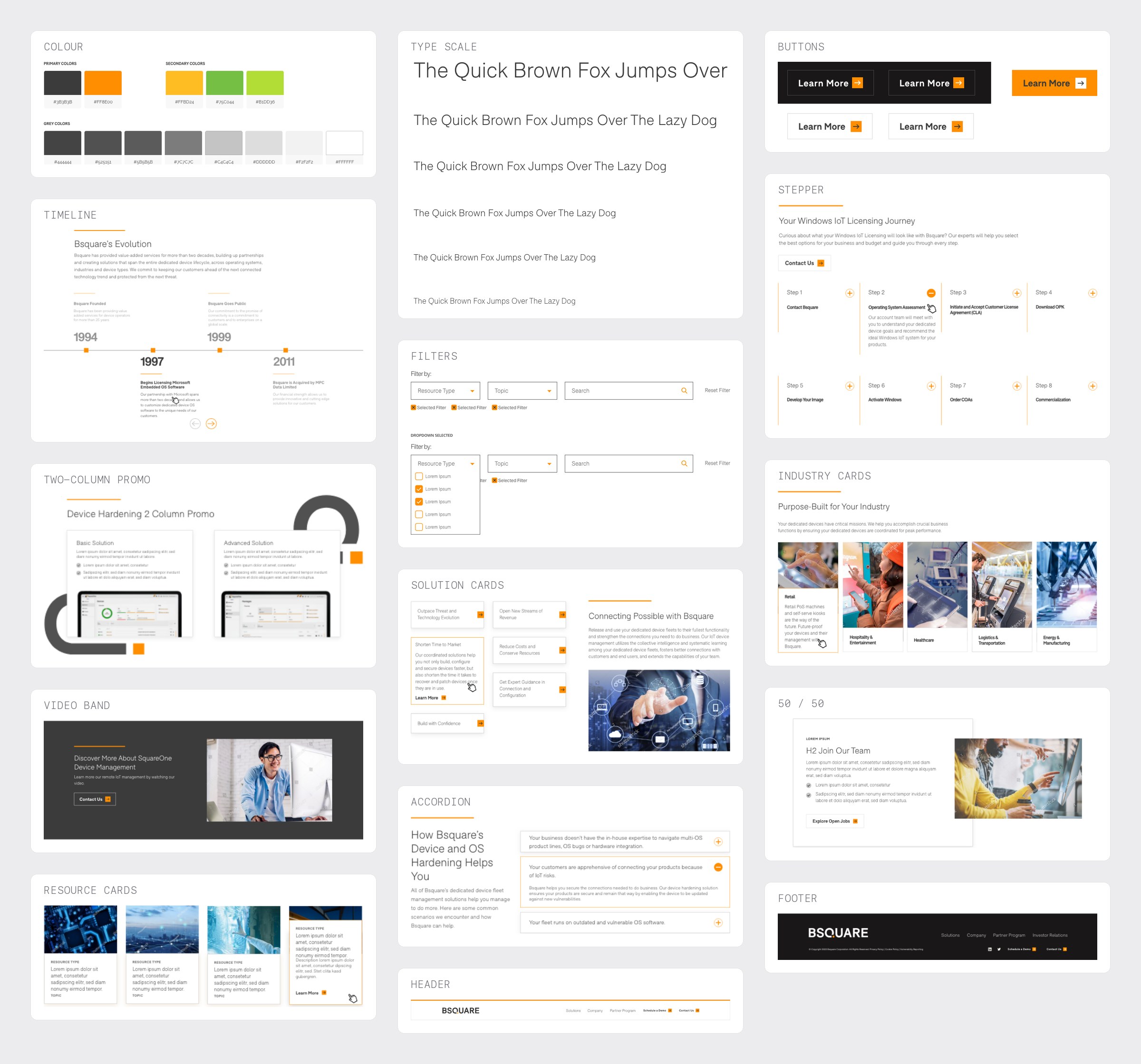
The library, from the style guide
Every section was designed at desktop, tablet, and phone widths, so responsive behavior lived in the component rather than in three separate page designs. The principles row, for example, goes from five cards to a two-column grid to a single list.
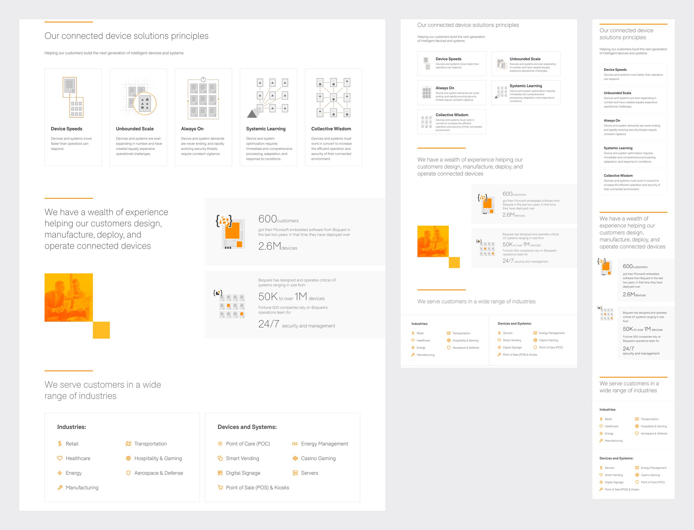
One homepage at three widths
Product pages were then assembled from the same system. The SquareOne page reuses the section headings, card rows, calls to action, navigation, and footer, and when a new need appeared it became a reusable module in the site’s WordPress build instead of a one-off page.
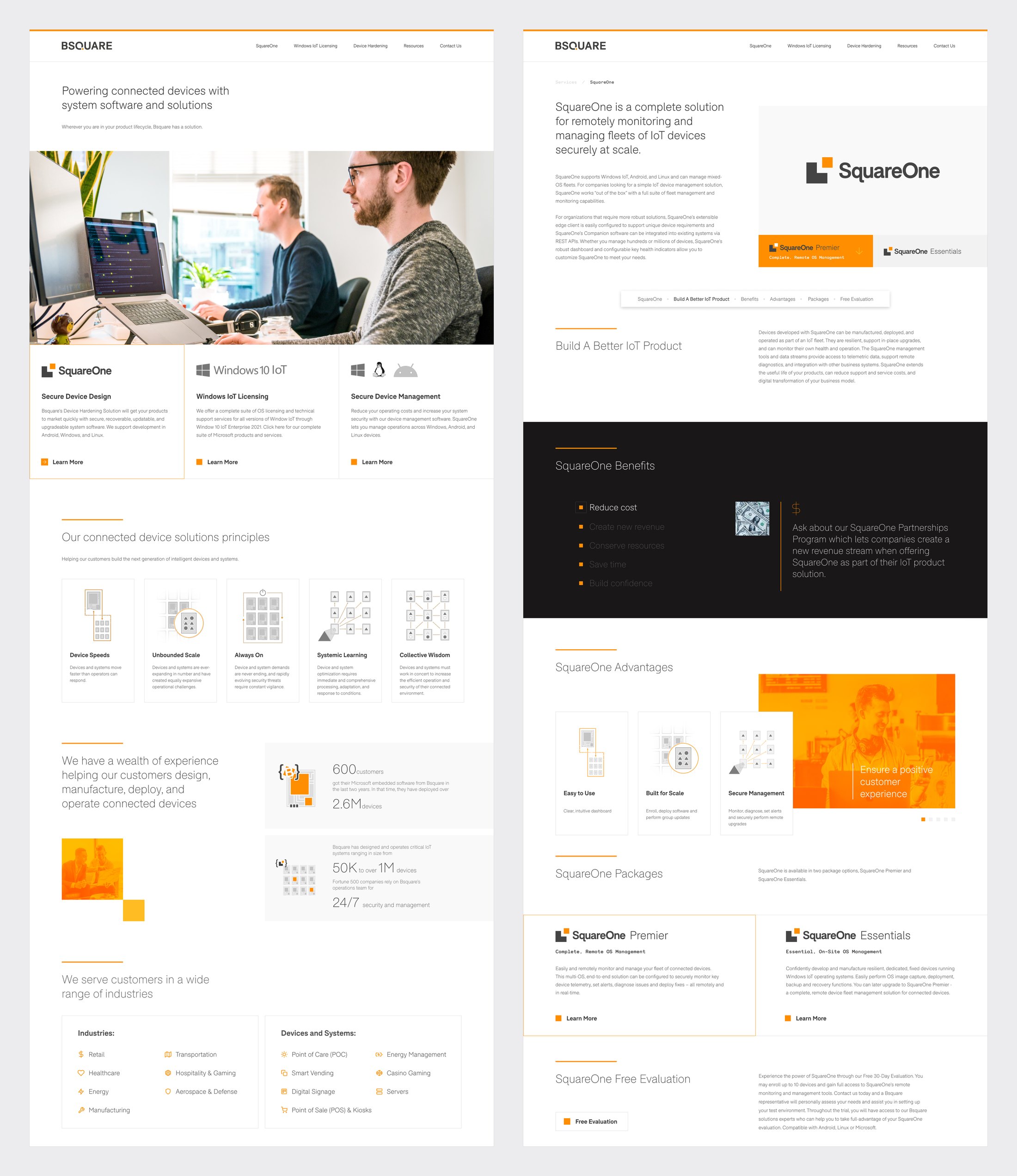
Different pages, same building blocks
The first pages took more setup. Each page after them became cheaper to design and build.
Campaigns
The website showed that reusable structure could cut repeated production work, so I applied the same model to marketing: one advertising framework that adapts across the seven standard display sizes, from a 728×90 leaderboard to a 160×600 skyscraper.
Type, call to action, imagery, and brand patterns stayed consistent while the layout adapted to each format. Instead of redesigning every banner size for every campaign, I built the framework as templates in a $20-a-month design tool, and it was eventually used across 80+ campaigns.
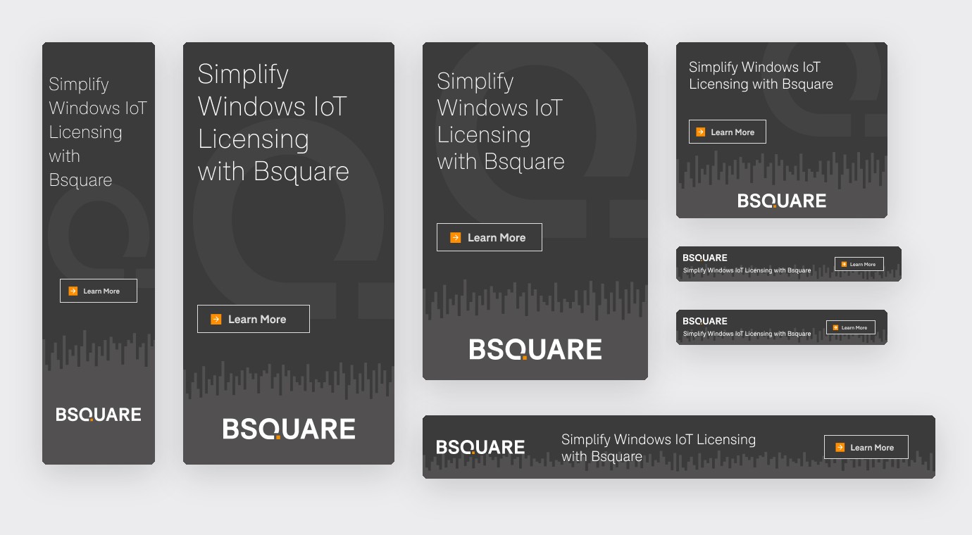
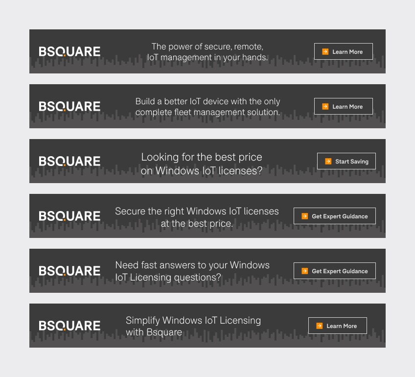
Seven sizes, six campaigns, one framework
Results
80+
campaigns from one ad framework
75%
less campaign production time
~$80K
avoided hiring cost a year
Where the campaign savings came from
Before the templates, every campaign’s deliverables were made from scratch by a dedicated designer. With the templates, I produced a full campaign set in a few hours, and campaign work took one to two hours of my day alongside everything else. That is at least 75% less production time than a full-time role, and the company did not need to hire a graphic designer, about $80K a year, for a $20 monthly subscription.
The number of components was never the point. The reusable structure kept reducing work after the website launched.
Lessons
Building the system first looked slower during the first weeks. It is also what made the three-month redesign possible and gave the team a foundation it kept reusing afterward.
I had made a similar call at Coalition (opens in a new tab) the year before: under a fixed deadline, prioritize the parts that will repeat instead of polishing every page on its own.
Under a short deadline, I invest first in the parts I know will repeat. The first pages take longer; everything after them gets faster.