Balsam Brands · 2021–2022
Balsam Brands: Simplifying a Seasonal Mobile Purchase
Balsam Brands sells high-consideration seasonal products online. Much of the business happens in a short holiday window, so mobile friction has an immediate cost and little time to recover after launch. I redesigned the shopping journey around the decisions customers actually make: narrowing the catalog, judging a product, and completing checkout.
Journey
Most shoppers arrived on a phone, and a tree often costs several hundred dollars. The experience had to work under real mobile conditions: a small screen, limited attention, and a high-consideration purchase.
I focused on the three points where shoppers had to act: narrowing a large catalog, judging whether a specific tree was right, and completing the purchase.
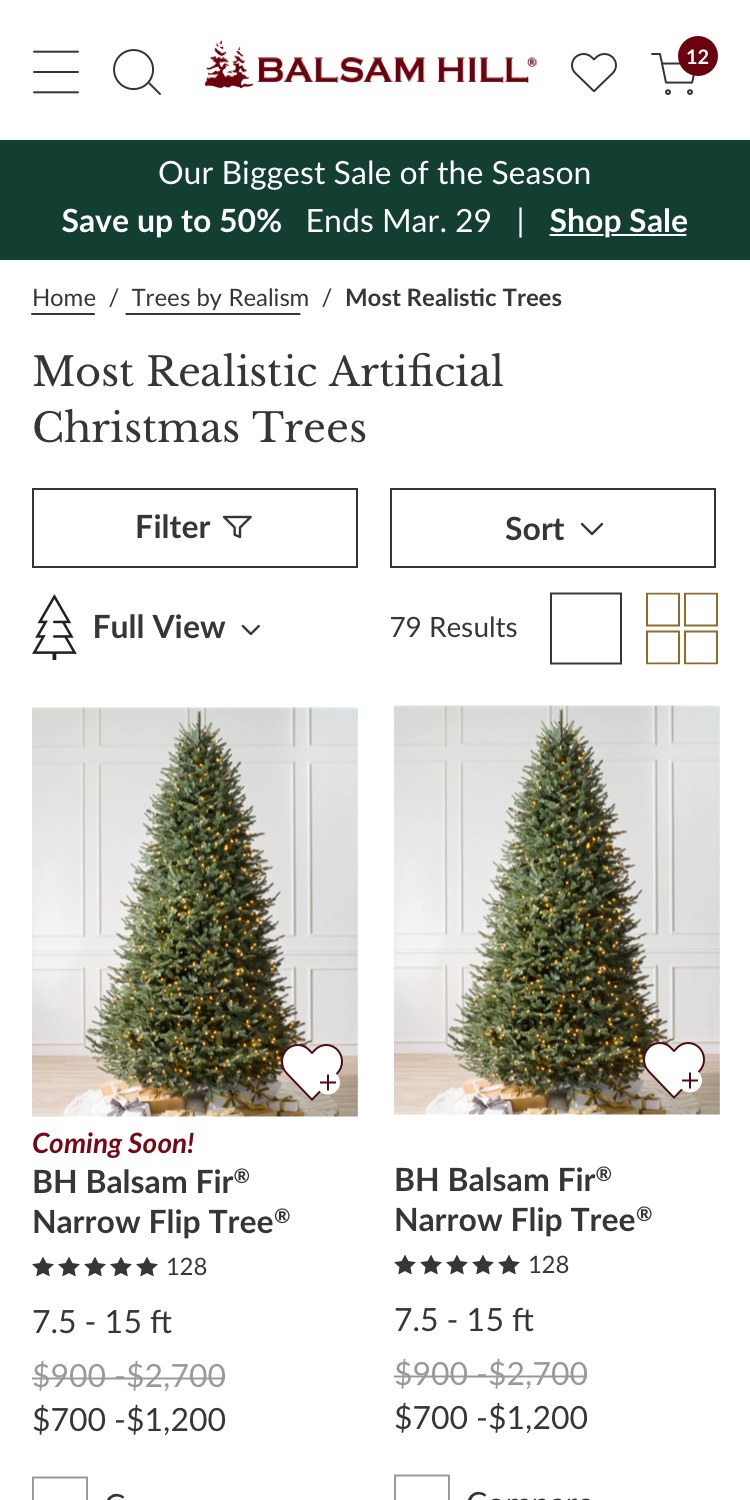
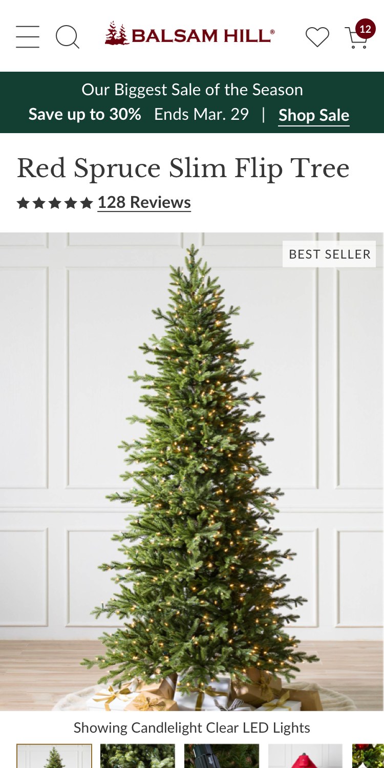
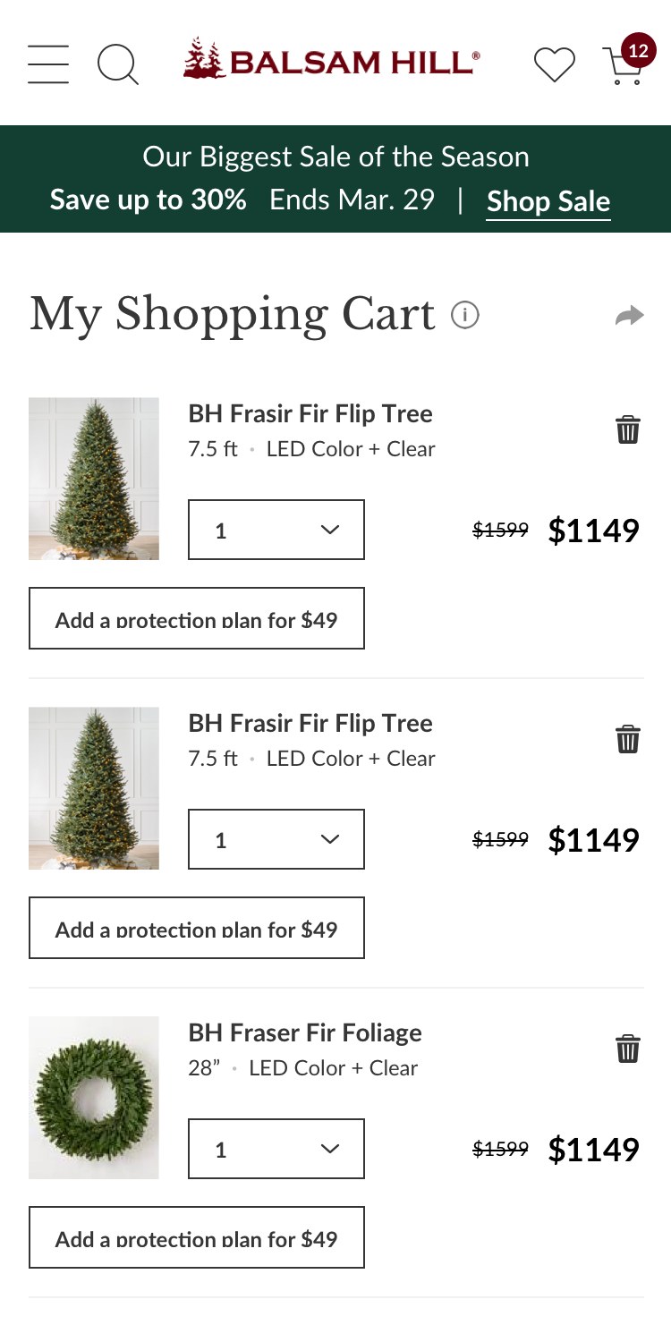
Listing, product, cart
Discovery
The catalog followed the company’s internal categories more than the way people choose a tree. On mobile, shoppers needed to narrow a large assortment quickly.
I reorganized filtering around the attributes people actually decide on: height, realism, light type, setup, and shape. Each filter explains its own options, so narrowing down never requires knowing how the catalog is organized.
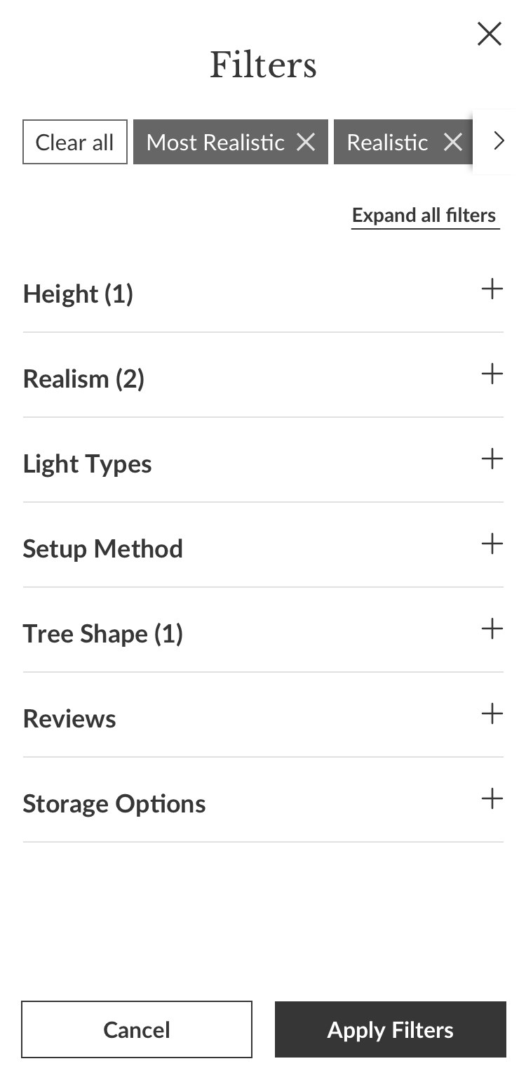
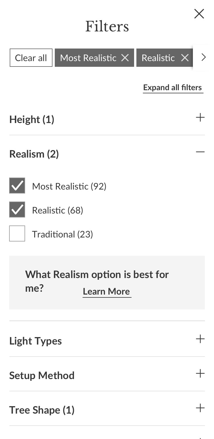
Filters named after the decision
Evaluation
Finding a tree was only half the decision. Shoppers still had to work out whether a specific tree came in their height and light type, and whether it could ship.
On the product page, every option carries its own availability: crossed out when it does not exist in the chosen height, a bell when it is coming soon, with the delivery window and a Notify Me link in one place. Height and light guides sit next to the options they explain.
The main button follows the selection, from Add To Cart to Unavailable in this Height or Coming Soon – Notify Me, so the answer is visible before checkout, not after.
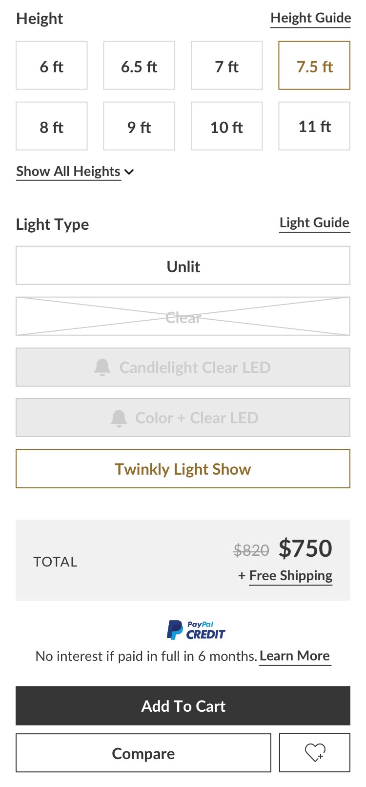
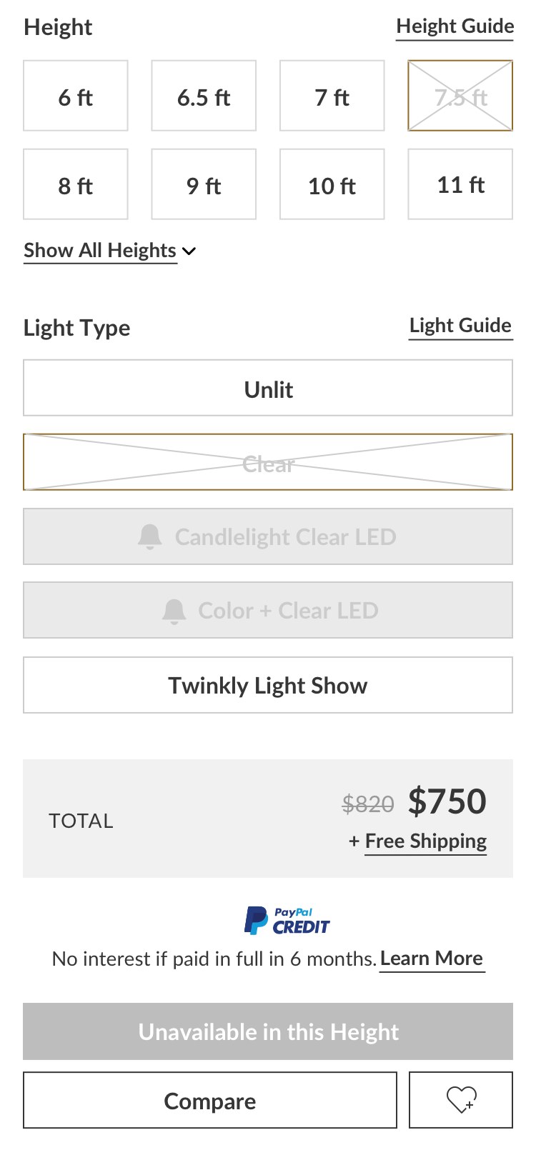
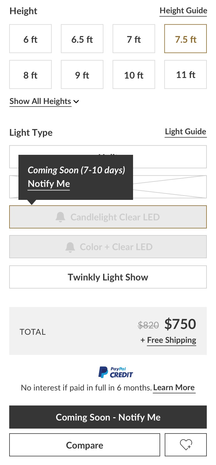
Available, unavailable, coming soon
Checkout
Checkout needed to work on a small screen without making a high-value purchase feel risky or hard to edit.
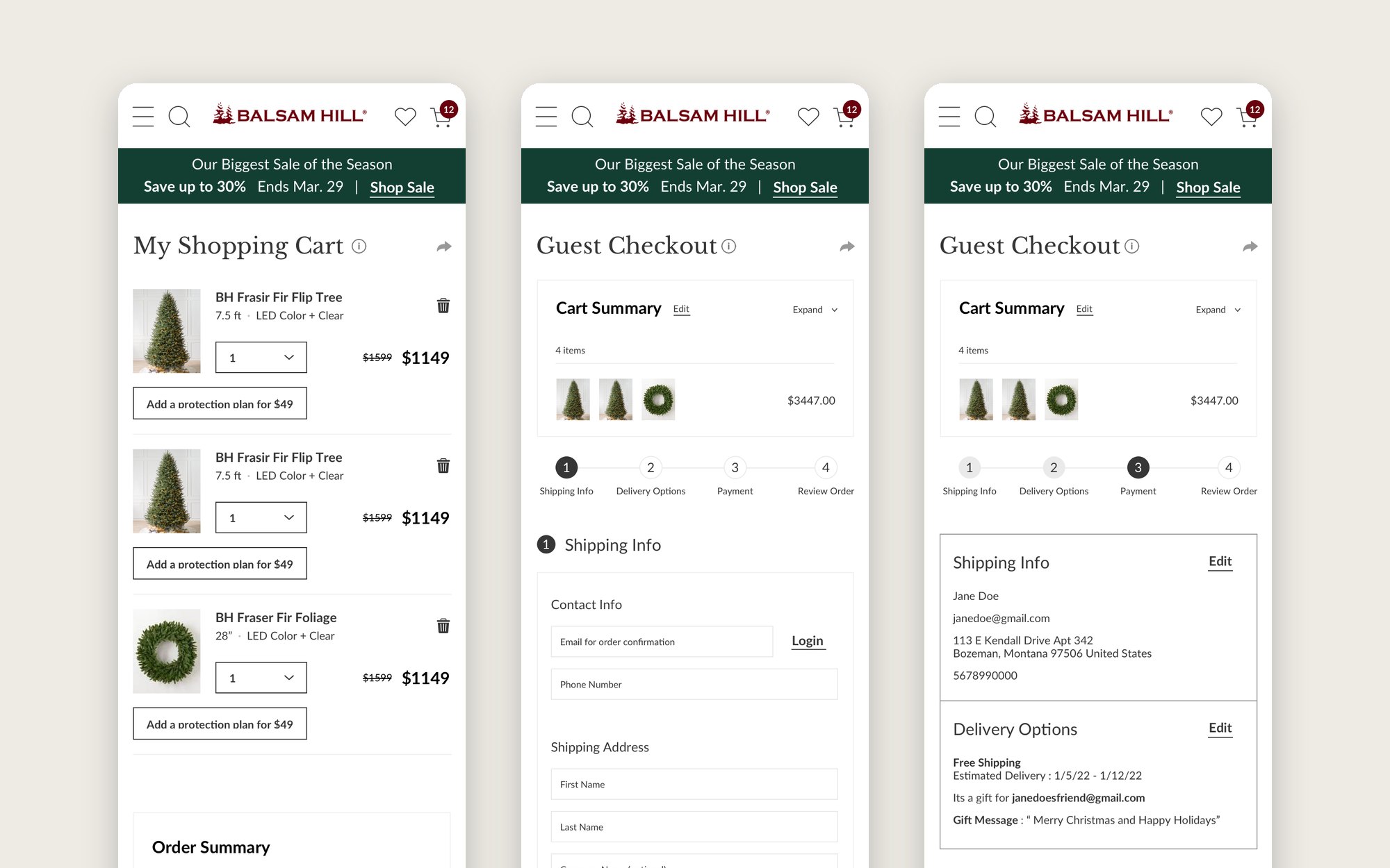
I split it into four numbered steps, consolidated fields, and made payment options easier to read. Each finished step collapses into a compact summary the shopper can still open and edit.
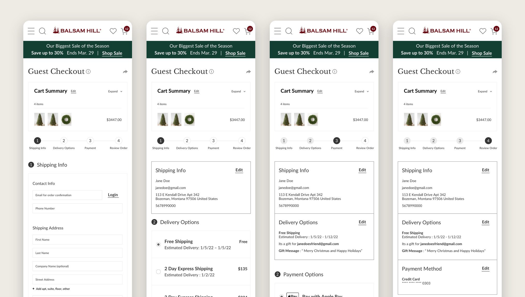
Four numbered steps
The goal was not to remove steps. It was to make each one easier to understand and recover from.
Testing
I tested the flows as interactive prototypes before engineering started. Testing surfaced navigation dead ends, unclear calls to action, and form confusion while they were still cheap to fix.
The product page shows the kind of change that came out of it. In the wireframe, an unavailable light sat in a grid with a separate Notify me link under it, and the main button said Add to Cart whatever was selected. In the tested prototype, each option states its own availability and the button states the result of the selection.
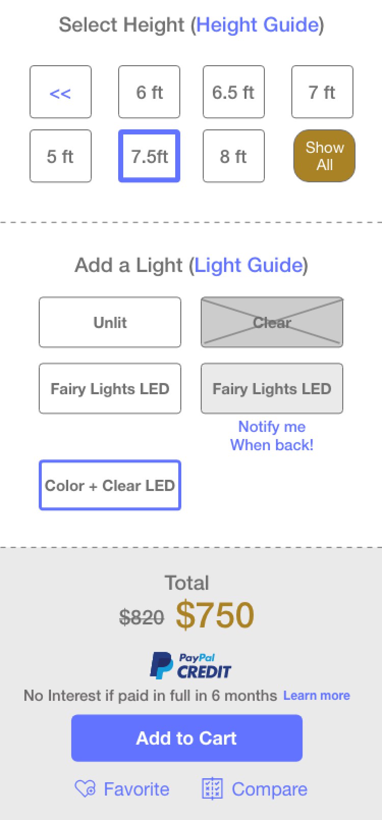
Wireframe, then prototype
Lessons
The strongest improvements came from aligning each screen with a shopper decision: how people narrow a large catalog, how they judge whether a tree is right for them, and how they finish the purchase without losing context.
Testing those decisions before development mattered more in a seasonal business, where there is little time to fix friction after launch. It is a habit I carried into far more complex products (opens in a new tab).
Design around the shopper’s decision, not the catalog’s structure.